Copper, Peach or Ginger: How to Pick the Right Copper
All three coppers look identical in the photo, but they're different formulas. Learn to read the reflect code and stop landing on the wrong tone.
Blendsor
Blendsor Team
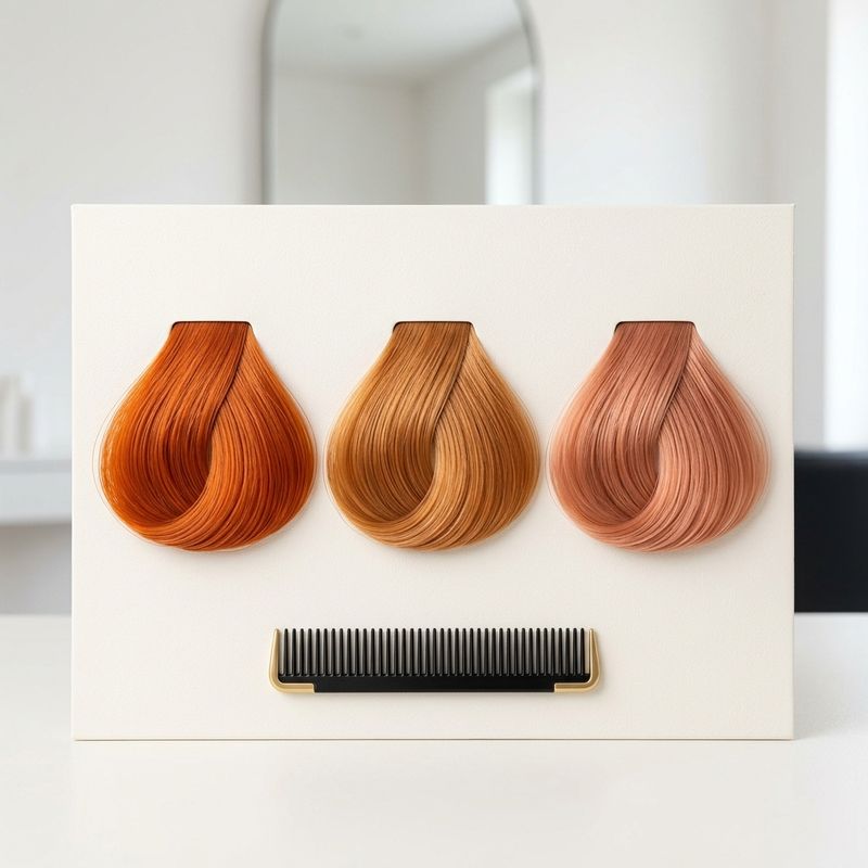
Your client pulls up a saved photo and says “I want this copper.”
You look at the screen. It’s copper, sure. But last week someone else showed you another “copper” photo, and the two had nothing in common. One was a bright orange you could spot across the room. The other was a muted peach that read almost like a warm blonde. And today you’ve got a third version in front of you.
If you work coppers behind the chair every day, this is where the real problem starts. It isn’t applying the shade. It’s diagnosing which of the three coppers they’re actually asking for before you touch the bowl. Because copper, ginger and peach look alike in a photo but they’re three different reflect builds. Whoever mixes one up for another fails at the read long before the technique.
Today you’ll learn to read that photo: what actually separates the three, how the reflect code decides the tone, and the three mistakes that turn each copper into the wrong shade.
What separates copper, peach and ginger?
All three can be built on the same kind of canvas: a clean, warm base from medium to light blonde, around level 7-8. The lightening curve Wella prints in its Koleston Perfect usage booklet shows why: at level 7 the underlying pigment exposed is orange/yellow, and at level 8 it’s yellow. That’s a base that works with copper instead of fighting it. On that shared base, what changes isn’t “how much copper” each one carries, as if they were the same pigment turned up or down. Each is its own reflect family, and that different build is what the eye reads as more or less saturated.
Put another way: the saturation you see is the result of the mix, not the lever you pull to get there. If you think “peach = copper with less intensity,” you’ll formulate it wrong, because peach calls for a different recipe.
So, are copper and ginger the same color? Close relatives, but not the same shade. In everyday English, “ginger” gets used for almost any redhead. In the bowl, ginger is the copper where you’ve let gold take the lead, which is why it reads softer and more natural than a straight copper. And copper peach (or peachy copper, as it’s often tagged) is the lightest and most muted of the three: gold-copper leads, pure copper is held back, and a rosy note shows up that neither copper nor ginger has. That’s why a “copper peach” photo so often reads almost like a warm blonde.
Here’s the quick read on all three:
| Shade | Subtone it reads | Reflect that leads | What tempers it | Perceived intensity | Best for |
|---|---|---|---|---|---|
| Copper (saturated) | Vibrant orange-copper | Copper | A copper-gold that adds dimension | High | Maximum impact, warm skin |
| Ginger (natural) | Balanced copper-gold | Gold-copper | A natural at the same level that grounds it | Medium | First copper, universal |
| Peach (baby copper) | Peachy-pink | Gold-copper, with copper level with it and never above | A measured rosy note | Low | Soft copper, entry point |
Look at the “reflect that leads” column. To reach peach you don’t strip pigment out of copper, you change which reflect leads: copper is led by copper; ginger is led by gold-copper with a natural grounding it; peach runs gold-copper level with copper while a rosy note brings the peach. All three carry copper in different measure, and what changes is which reflect calls the shots. Different starting points, not degrees of the same thing.
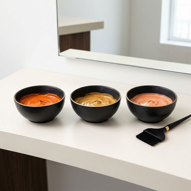
Pro tip: when someone shows you the photo, don’t ask “how intense do you want it?”. Ask “more orange or more peach?”. That answer tells you which reflect has to lead, and that’s the decision that actually matters.
The reflect code is what decides the subtone
Here’s the engine behind the whole diagnosis. After the level comes the reflect, but every color house writes it in its own alphabet. L’Oréal puts it after the dot: the Majirel color chart for the US calls those figures the “primary tone of color” and “secondary tone of color”, and assigns .3 to gold and .4 to copper. In Wella Koleston Perfect it goes after the slash, and what /4 is called depends on the market: Wella’s international legend names it “Red (warm)”, while its Spanish color chart calls it copper (7/4, Rubio Mediano Cobrizo). Check what the chart in your country calls it. In Igora Royal, copper is -7. A “7.43” that doesn’t say which chart it comes from can’t be read with any confidence.
Within a single chart, the salon reading that serves you is this: the first reflect sets the direction and the second tempers it. Read that way, on the Majirel chart an 8.43 and an 8.34 aren’t the same tone: in 8.43 copper leads and gold rides along; in 8.34 gold leads and copper only peeks through. Same level, two tones anyone can tell apart without knowing why.
Here’s how the copper family reads on that L’Oréal chart:
| Code (Majirel, US chart) | How the chart names it | What it brings to the mix |
|---|---|---|
| .4 | Copper (C) | Straight copper; on its own, it tends to go flat |
| .43 | Copper + gold (CG) | Luminous copper with shine |
| .34 | Gold + copper (GC) | Gold with a copper glint, soft |
| Natural (7, 8…) | Natural (N) | No reflect; lowers the mix’s saturation |
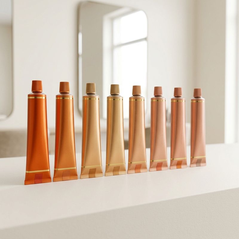
From here comes the rule that saves the most coppers: don’t run straight copper as the only shade in your formula. Blend at least two reflects. Copper on its own tends to drop into a flat, uniform orange with no dimension. Understanding how each reflect interacts with the lift level of each base is what separates a predictable result from a nasty surprise at the rinse.
The recipes for each shade, by brand and starting level, live in the cluster guides: copper and its variants by brand, ginger step by step and baby copper by level. This article doesn’t repeat them. It teaches you which one to open.
Developer doesn’t change the subtone: it changes whether you lift or deposit
This is where most people get lost, and it’s surprisingly simple: the developer volume doesn’t decide the color, it decides the chemical work.
The subtone is chosen by the reflects. The developer only answers a different question: do I need to lift the hair, or just deposit tone on top?
- Depositing on a base that’s already clean: here the data sheet for your line decides, not a rule of thumb. In its Koleston Perfect fact sheet, Wella keeps 6% for one level of lift, grey coverage or working at the same depth or darker, and 4% for same depth or darker on natural hair with no grey to cover. L’Oréal publishes Majirel (US document) at 1:1.5, and its color chart lists 20 vol for up to 2 levels of lift or grey coverage, and 30 vol for up to 3. If the canvas came from bleaching, there’s nothing left to lift: a higher volume doesn’t add copper, it just adds chemical work to a fibre that’s already had its share. How each brand splits color and developer is in hair dye mixing ratios.
- Lower levels (medium brown and down): before you deposit, you have to open the base first, and that often means two sessions. On the same Koleston curve, levels 4 and 5 expose reddish/brown and reddish/orange, not the orange/yellow copper wants underneath. That’s why saturated copper forced onto a dark base in one pass tends to pull red. If that’s your case, start with copper hair on a dark base.
- A demi to refresh (Wella Color Touch and similar): this is maintenance, not base formulation. Wella mixes Color Touch 1:2 with its 1.9% or 4% emulsion and positions it for same-depth color, going darker or blending up to 50% grey. It brings the vibrancy back between visits; when it’s due depends on how the reflect fades on each head of hair, which we go into in how often to retouch roots and tone. Different chemistry, different intent: don’t confuse it with building the tone.
And before you weigh the first gram, two tests and one check. Oxidative color, and a demi activated with an emulsion, both need their allergy alert test 48 hours ahead; Wella and L’Oréal call for it in the instructions for their lines (when to book it so it doesn’t hold up the service). If the hair has a history (bleach, highlights, previous color or henna), try the copper on a hidden strand first: that’s where you see whether the reflect grabs, spikes or goes muddy (strand test). And if that strand has been bleached, stretch it wet before you trust it; if it keeps stretching and doesn’t spring back, the hair elasticity test is telling you the color can wait.
The practical takeaway: developer decides the chemical work, but a hotter lift changes the canvas your reflect lands on. The same peach can be built with permanent color on an already-lightened base and refreshed later with a demi. The reflect leads the subtone; the volume only says how much you have to open before you deposit.
Pro tip: before you decide the volume, diagnose the real canvas in front of you, not the one in the photo. A 7-8 base with warm residue from a previous copper already brings plenty of orange: there, straight copper is excess and you load the gold-copper instead. And porous hair grabs extra copper reflect. Always assess hair porosity before locking the formula.
The 3 mistakes that turn each copper into the wrong shade
Each of the three shades has a typical failure mode. And in all three, the mistake is already in the mix the moment you pick the dominant reflect.
-
Straight copper alone → flat orange. The classic one. Without a second reflect to add dimension, saturated copper flattens into a uniform, out-of-the-tube orange. The fix is the rule above: pair the copper with a copper-gold or a gold so it can breathe.
-
Ginger without the natural → it reads rawer than it should. Ginger is built by gold-copper and gold; the natural doesn’t add “ginger,” it grounds the mix and drops the saturation so it reads natural. Take it out and the formula gets more vivid and saturated, and loses the muted feel that makes a beautiful ginger. The natural is the brake, not the engine. Watch it on grey, though: there the natural also does coverage duty, so don’t pull it just to chase more vibrancy.
-
Peach with too much copper → it drifts to orange. The most common baby copper mistake is exactly that: loading the copper chasing “more copper.” Peach does carry copper, but level with the gold-copper and with a measured rosy note. As a working rule, the gold-copper (or the gold) always equals or beats the copper. The moment pure copper pushes past that balance and takes over, the peach vanishes and you’re left with a generic copper. Here the copper stays on a leash, not loose.
All three mistakes share the same root: treating the three shades as one copper with more or less intensity. They aren’t. Choose which reflect leads first, and half the work is done.
Frequently asked questions
What’s the real difference between copper, ginger and peach?
The reflect build, not the amount of copper. Copper is led by the copper reflect and reads saturated. Ginger is led by gold-copper, with a natural that grounds it, and reads natural. Peach runs gold-copper level with copper, with a rosy note, and reads peachy-pink. So copper and ginger aren’t the same color, even though they’re in the same family. All three can sit on the same 7-8 base: what changes is which reflect calls the shots.
Can I get all three on the same base?
Yes, if the base is clean at level 7-8. That warm canvas takes all three subtones; you make the difference in the bowl, not in the lift. From lower levels you open the base first, and there the starting point shapes the result.
What developer do I use for each one?
Same criterion for all three: the volume depends on whether you need to lift, not on the shade you’re after. On an already-lightened base you’re only depositing, so pick the developer your line’s data sheet assigns to same-depth work. On a natural base that still has to come up, use whatever that sheet sets for those levels. To refresh between visits, a demi with its own emulsion (Wella’s Color Touch goes 1:2 with 1.9% or 4%).
Why does my copper always end up orange?
Almost always from running straight copper as the only shade in the formula, or from starting on a base with leftover orange you didn’t offset. Blend at least two reflects and pull back the copper if the canvas is already warm. If you were after peach or ginger, that excess copper is precisely what breaks them.
In short
- The three coppers are distinct reflect families, not one pigment dialed up or down.
- The reflect decides the subtone: within one chart, the first sets the direction and the second tempers it. And a code with no brand can’t be read: copper is .4 at L’Oréal and -7 in Igora, and Wella’s /4 changes name by market.
- Developer doesn’t decide the color: it decides whether you lift or deposit, and your line’s data sheet sets the volume. The demi is maintenance, different chemistry.
- Each shade has its failure mode: flat copper when it runs alone, raw ginger without the natural, orange peach from too much copper.
Formulate copper shades with AI
Want to decide between copper, ginger or peach based on each client’s starting level and real chemical history, instead of gambling in the bowl?
What's the difference between copper, peach and ginger?
In the app, we ask you a question like this one, but about your own client.
Up for this week’s case? → More on brunettes and coppers →Related articles


Practice with our colorimetry tools
Calculators, neutralization wheel, AI consultation...
The Blendsor newsletter
Color techniques and trends for professionals. No spam.
A client in the chair right now?
The Blendsor advisor gives you the precise formula for this technique with your salon's brands — and saves it to your client's card.
Ask about your caseWritten by the Blendsor team
Professional hair colorimetry experts with experience in AI-assisted formulation. We combine color science, salon practice and technology to help colorists formulate with precision.